Walking down the aisles of a modern supermarket can feel like visiting an art gallery. Every shelf displays a meticulously curated selection of products designed to catch the eye and promise a superior culinary experience. Brands invest millions into ensuring their items stand out, using minimalist typography, matte finishes, and earthy tones to signal quality and health. Consumers naturally gravitate towards these beautiful boxes and bottles, assuming the contents match the sophisticated exterior. This visual appeal often masks the reality of what lies inside the packet. We are constantly influenced by superficial aesthetics, leading us to make purchasing decisions based on graphic design rather than nutritional value or ethical production methods.
The psychology behind supermarket aesthetics
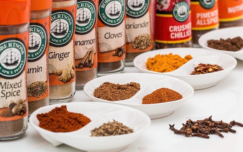
Food marketers understand exactly how human brains respond to specific visual cues. A pastel-coloured box with rustic illustrations suggests the product inside is natural, wholesome, and minimally processed. Conversely, vibrant neon wrappers are reserved for sugary snacks aimed at children. When a brand undergoes a redesign to feature clean lines and lots of negative space, it instantly elevates its perceived market value. Shoppers are willing to pay a premium for items that look like they belong in a boutique health food shop, even if the ingredients remain entirely unchanged from their previous, cheaper-looking iteration. This psychological manipulation ensures that we often buy the packaging rather than the actual food.
The reliance on buzzwords further compounds the issue of deceptive grocery store marketing. Phrases like artisanal, farm-fresh, and sustainably sourced are plastered across beautifully designed labels, yet these terms are often entirely unregulated. A product boasting about being made with real fruit might contain only a fraction of a percentage of fruit juice, with the rest of the flavour coming from artificial additives. The packaging does its job by creating a halo effect, convincing the buyer that they are making a responsible and healthy choice. Reading the back of the packet usually tells a completely different story, revealing a long list of preservatives, emulsifiers, and hidden sugars that contradict the wholesome image presented on the front.
Looking beyond the surface level
Navigating this visually overwhelming environment requires a conscious shift in shopping habits. The most effective way to see past the grocery store glow-up is to completely ignore the front of the packaging. The nutritional information panel and the ingredients list are the only parts of the product that provide factual, legally required information. Ingredients are listed in order of weight, meaning that if sugar or a chemical preservative appears in the first few spots, the product is highly processed regardless of how rustic the packaging looks. Developing the habit of immediately turning a product around before placing it in the shopping trolley is a crucial step for any informed consumer.
It is also vital to consider the environmental impact of these premium aesthetic choices. Heavy glass bottles, layered cardboard boxes, and unrecyclable matte plastics are frequently used to make an item feel expensive and heavy in the hand. While these materials successfully convey a sense of luxury, they contribute significantly to global waste. The carbon footprint of transporting heavy, over-packaged goods is massive, completely negating any eco-friendly claims the brand might make in its marketing materials. True sustainability often looks much simpler and comes with far less packaging altogether.
Making informed choices at the checkout
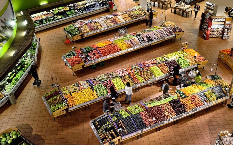
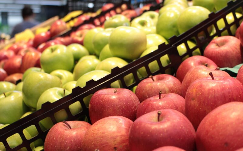
Taking control of your grocery shopping means redefining what quality looks like. Whole foods such as loose vegetables, grains, and legumes do not need a marketing team or a graphic designer to prove their nutritional worth. When purchasing packaged goods, try to seek out brands that prioritise transparency over aesthetics. Look for short ingredient lists containing items you can actually recognise and pronounce. By refusing to pay a premium for clever graphic design, you send a clear message to food manufacturers about what you truly value.
The next time you find yourself drawn to a beautifully designed box on the supermarket shelf, take a moment to question your attraction. Challenge yourself to evaluate the product based solely on its nutritional content and environmental footprint. Seeing past the grocery store glow-up allows you to make choices that genuinely benefit your health, your wallet, and the planet.